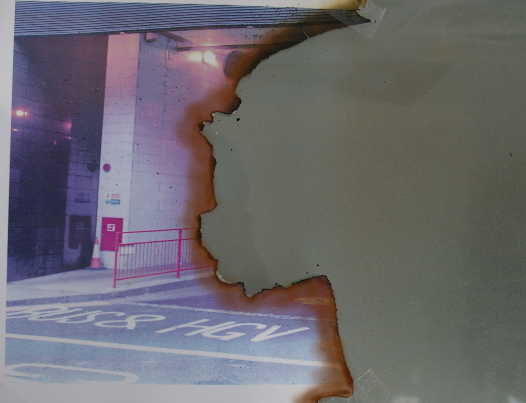
For this set of photos I was aiming to imitate the work of very unknown, freelance photographer who's examples I found when surfing an internet blog. What I found was that he had taken several pictures and then proceeded to burn them as a metaphorical representation of destroying and getting rid of the memories that they belong to. As an interpretation of this, I have taken several photos, all of different environments and edited them too look old and as though they have begun to decay themselves. Once taken and edited, I have printed them on a printer which had very low amounts of ink, so that the images look and feel disrupted, but look slightly antique in a sense. I then proceed to burn the images in adventurous and varying ways to try and make each photo as unique and individual as possible. After that, I then stuck the remains down onto a tinted glass table which would be used as the plain background, and then retook each photo again. I then put them back on Photoshop and cropped them down, colouring the edges of the burn marks using the paint brush tool making them look more orange and relatable to the work of Luis Alvarez. This top photo was taken on a busy high street. I originally didn't edit the photo too much to begin with, i.e. in relation to making it look older, however, I did add certain effects to it such as small dirt and scratch markings in order to make it look more worn down. I decided to burn half of the photo as I felt it had the bigger impact in making it look as though it had decayed. The burnt, blackened edges coincide perfectly with the orange tint that I added to give off the effect that the photos have been severely damaged. The bonus of both physically disrupting the image and then editing it on Photoshop is that you are able to personalise them in very specific ways in order to make them look as in depth as you want, however, they also look authentic and wouldn't look as animated as they may have if I had done the whole thing via an editing system. I also avoided the potential bland look that the photos may have had if I had done them all by hand, and therefore Photoshop prompted me to add more flavour to each image. The restrictions of this method however, is that I was unable to fully match the individuality and natural look of Alverez's photos, and was only able to produce a rough interpretation of his works, rather than a indistinguishable set of photos.
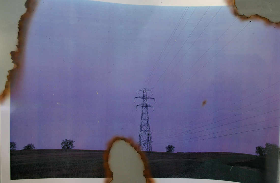
This photo is similar to the last in that I only really edited it before burning it by adding scratch and dirt marks. This gave off the impression that the photo again, was damaged and slightly worn down due to potentially the length of time that it had been printed for. The colouring of the photo beautifully contrasts with the forceful colours of the burns, and the precision of each rip in the photo was purposeful so that you were still able to identify the photos central focus without too much disruption. The dark tone and lighting of the photo coincides with the overall theme of decay and therefore I feel that because of this it better suits the purpose of this particular contact sheet. As this photo is quite vague and ill-defined, it connects with the idea of them being memories and interpretations of what people have experienced in the past, as memories are not clear or very exact visions. The fact that the photograph is slanted, and you are able to see its outline and a background behind it, only reminds viewers that these are in fact evaluations concerning the decay of photography/memories and not of actual environments.
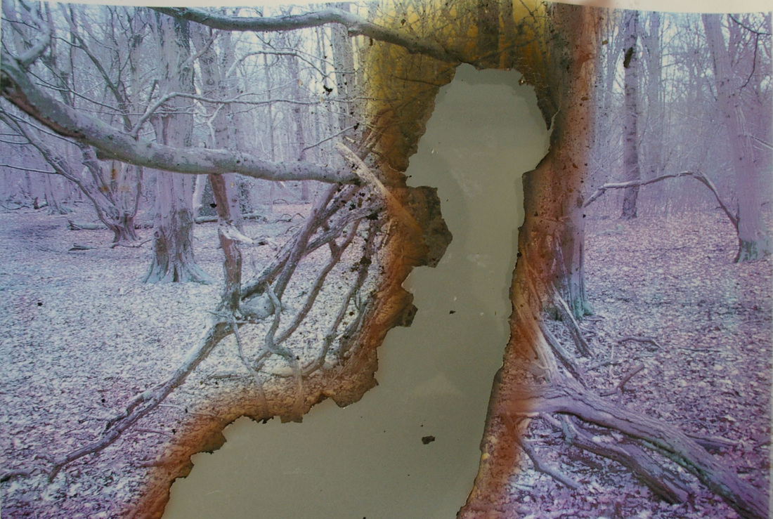
After I had taken this particular photo, I put it onto Photoshop in order to dull down the brightness and intensity of the colours. This made the photo look far more bland and lifeless, which actually fits perfectly into the environment in which I took it. I didn't use any form of lighting other than natural lighting when I took the photo, and therefore it resulted in slight glare from the sunlight. This is what therefore prompted me to numb the colours and which converted the photo from what was originally perceivable as a bright and upbeat photograph of woodland, to the cold, darkened and soulless photo that it became. The printer actually came into full affect when printing this photograph, as remnants of the decline in coloured ink are visible via some of the less accurate interpretations of colour, i.e. the apparent green and red streaks noticeable in the mid section of the photograph. I didn't actually rely to heavily on colouring this photo myself afterwards in Photoshop, as the aftermath from the burns marks already created a very visible pattern of crisp black marks conductive to a yellow/orange smear at the top of the frame.
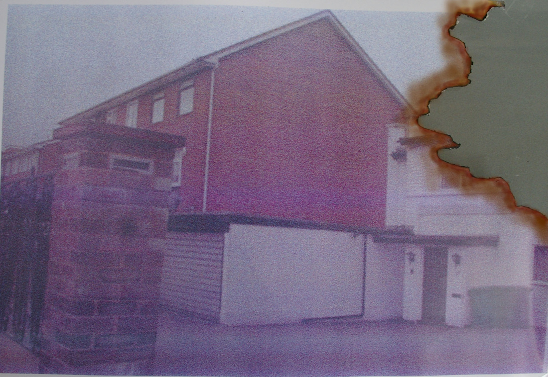
I took this photo in a suburban environment as my initial aim was to edit it to look as though it was a photograph that had been taken back in the 60's or 70's, and I felt this was the best environment to portray that particular realism. I therefore knew that in order to further continue with the authenticity of its look, that I had to edit the colour of it in Photoshop, making it look grainy and not very well pronounced, as cameras in that time period were not as attentive, and photographs never came out as well developed as they do now. I did this by going on Image, adjustments and altering the colour balance, then adding a slight Gaussian Blur to the photo and finishing it off by increasing the Noise of the photo, by clicking Filter - Noise - Add Noise. As this photo looks slightly older than others, you can assume that it represents the idea that the memory is slightly older, and as the burn marks are not as drastic, you can also assume that its the persons attempt at not trying to forget about this, or maybe even them trying to remember it but slowly forgetting. The lighting in the photo is also very dim, which pays attribute to the idea again that the memory is potentially fading and becoming faint, as I feel that bright, clear and focused images would contrast too heavily with this idea.
