
As these were the first photos that I took, I wanted them to represent decay in the most obvious/blatant way possible. Also, as I had no artist research that I had to compare them to, I was able to create a variety of different images all unique and individual however, still linking in to the topic that I had decided to focus on. This image was a close up of a passion fruit that I had smashed in a care-free and non-specific way. The result is very messy however, I feel that because of this, the photo has become far more enjoyable to look at. The bold and eye-catching colour code that it has in contrast with the plain black backdrop creates for an emphatic amount of focus to be directed at the subject itself. The close-up combined with the use of bright lighting heavily aimed at it, makes the image far more intense and overwhelming to look at than it would of been if taken from a further angle with a lesser light intensity.
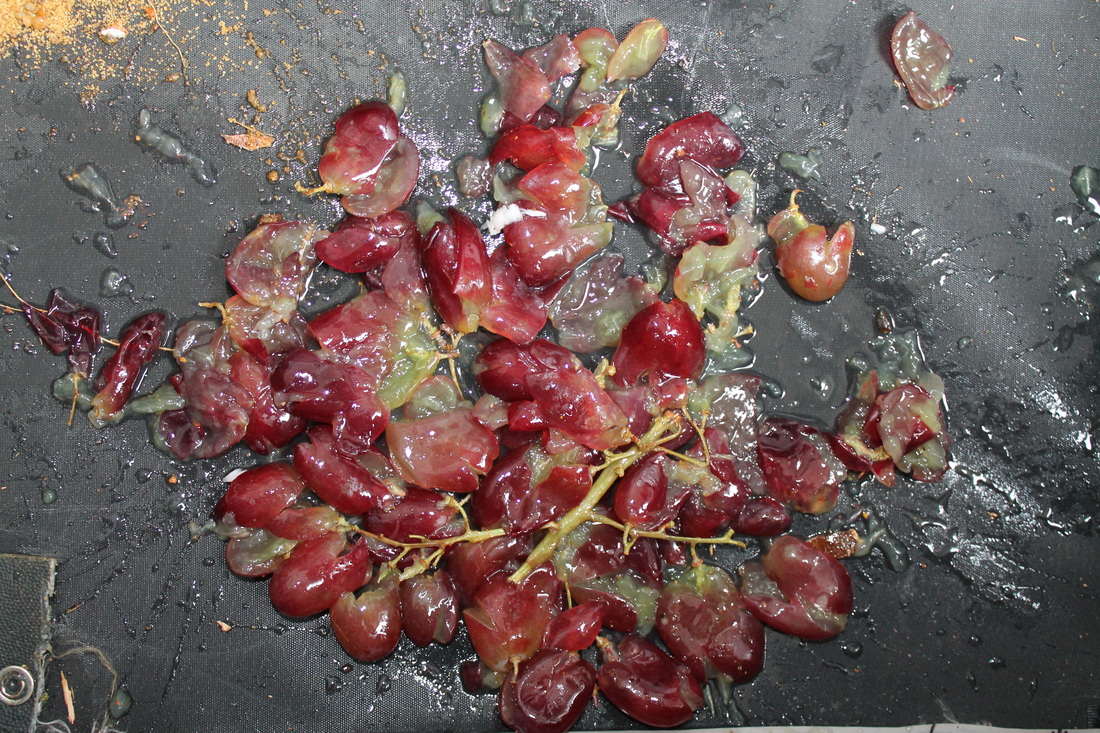
This image was far more planned and coordinated, and the composition of the photo was more purposeful than the previous photo. I had decided that I wanted to squash and destroy the grapes in a way so that they would fill the frame and almost look as though there was a specific pattern or layout to them. I had grouped them together and proceeded to squish them so that they would remain connected in a bundle even when destroyed. I had decided that this would be more beneficial than simply discarding them amongst a canvas as the closer compact they are, the more attention and focus they obtain with a audience, I believe it also makes the photo look far more attractive and potent when the focus is collected into one specific region of the photo, and more specifically the centre of the frame which would therefore abide by the golden section rule, which basically states that when something resides in the middle section of a photograph, it becomes more appealing for viewers to look at, which is something I believe that I have achieved here. The lighting in this photo again is very bright, as I feel it best complements the colour of the subject and its overall messy/wet and ungraceful structure.
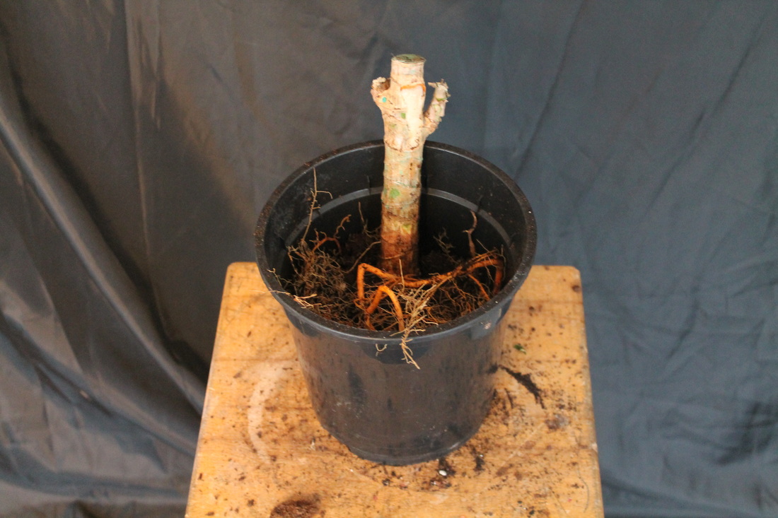
For this particular set of photos, I wanted to show the transition of a plant slowly being destroyed and becoming void of life. In order for me to do this, I had to take a variety of photographs at many different stages in the process in order to give the audience the best perspective on the change. This photo was taken nearer to the end of the selection, as you can see the plant by this point had decomposed quite severely from it original structure. The lighting wasn't so intense this time, as I felt that it contrasted and contradicted the colour schemes of the subject, making them look blander and lifeless rather than complementing them like it did with the previous two. Therefore, I used a flood lamp set on a lower intensity in order to create a dimmer light which better filled the surrounding of the photograph. I decided on a black backdrop with quite a boring wooden stool used as the setting for this environment as it didn't distract the audience in any way, plus it had a similar colour code as the subject, emphasising the overall tone of the photo. By positioning the camera above the subject looking down on the environment, I was able to give the audience a better view of the content of the photograph.
